Weekly Gantt Chart Template Setup Instructions
Setup Instructions
Despite this being an Automatic Weekly Gantt Chart, this template is easy to use; to add tasks, all you need to do is follow the steps below.
Add Tasks
Choose a colour from the Label column (B); this will set the colour of the mini progress bar found in column I and the primary Gantt Chart colour.
Enter a Project or Department name in column C to associate related tasks with the same colour, or use this for your Task Title.
Enter a Task Description or Task Title, depending on your preference.
Add a person to whom the task relates (Assignee). You can type their name or use the Smart People Chips in Google Sheets.
Set a Start Date for the task
Set an End Date for the task
Once this information has been added, you should see your chosen colour display in the main Gantt Chart for the set number of days.
Days, Progress & Progress %
The Days column will calculate automatically (This counts working days only using the NETWORKDAYS function - Monday to Friday). The mini progress bar will also update as you set the Progress percentage (Column J) for a given task. This helps to visualise your progress across all tasks.
The main Gantt Chart
The main Gantt Chart will automatically display the duration of tasks based on the start and end dates in your chosen colour by week number.
As you mark tasks as complete with the checkbox in column A, the Week number, Month, week beginning date and year along the top of the Gantt Chart will automatically update to hide past dates. You’ll never need to add new columns at the end, as the chart will constantly update as you progress through your tasks. You just need to ensure you check the tasks off in column A when they are completed.
Completing Tasks
When you check tasks off, you can filter this table to hide those tasks by looking only for FALSE values (incomplete tasks). This will keep everything nice and tidy, but it’s optional; you can leave completed tasks displayed; they will just grey out when marked as completed.
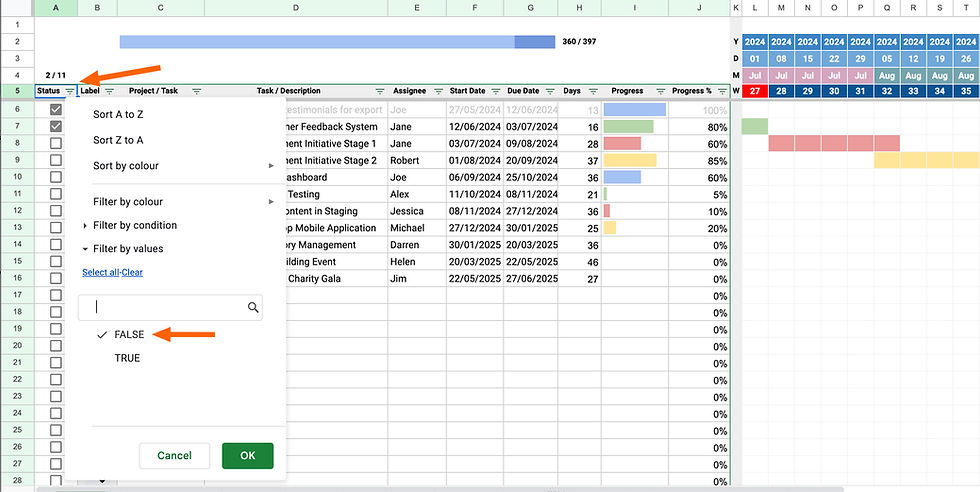
You will see this pop-up if you try to filter the table, but filtering this table won’t cause any harm, so you can click OK here.

This warning has been added to prevent any accidental changes to particular cells and ranges, but filtering a table won't change any formulas or data; it simply hides or shows the data based on the chosen filter.
Change colours
If you want to change the colour of the drop-down labels, mini progress bar chart and the main Gantt Chart, you’ll need to make a few changes to ensure everything works correctly. I would recommend leaving these colours to avoid errors, but I’ve detailed the steps below if this is something you wish to do.
Mini Progress Bar Chart Colours
The mini progress bar chart uses named range references, which can be found in the settings tab (this is hidden by default to avoid any accidental changes)
If you wish to change any of these colours, it’s best to leave column B alone in the Settings tab as these are associated with the conditional formatting of the main Gantt Chart; therefore, only change the Hex value in column C to something else. The formulas in column I of the Gantt Chart shouldn’t need to be adjusted if you do it this way.
Drop-down Label Colours
Changing the drop-down labels requires editing each Background colour, as shown below.

You can bring this edit window up as shown above by clicking on the edit pencil in any dropdown menu, as shown below.

Gantt Chart Colours
The Gantt Chart colours use a custom formula that looks for the naming in column B of the Setting tab, so if you wish to change the colour of these, you will need to adjust column B of the Setting tab and the custom formula for each conditional formatting rule applied to the Gantt Chart area.
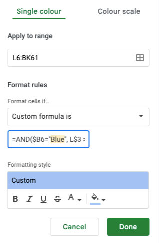
Here is an example of the conditional formatting for the Blue colour. This formula looks for three conditions, but it’s the first one that matters if you want to change the colour.
=AND($B6="Blue", L$3 >= $F6, L$3 <= $G6)You need to adjust this “Blue” to a name that matches the name found in column B of the settings tab for that given Hex value.
Adjusting the Date format
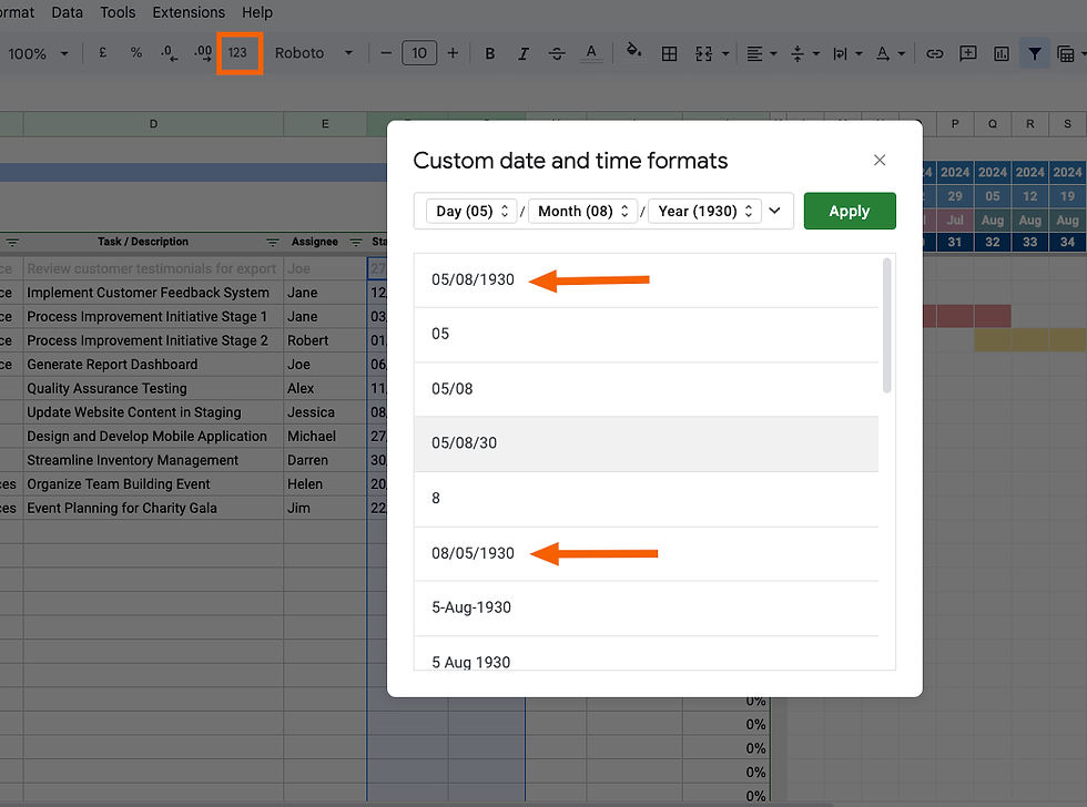
Most countries use the date format with Day / Month / Year (dd/mm/yyyy), such as 17/01/2024 for 17th January 2024, for example. This includes most European countries. The format - Month / Day / Year (m/d/yyyy) is unique to the United States and perhaps Canada. It’s possible to adjust the date format within this sheet by adjusting the locale settings.
You can check the Spreadsheet settings for Locale by going to the File > Settings menu and choosing your Locale from the drop-down.

Any new dates that you add will follow the new locale settings. If you need to adjust existing dates within the sheet, you can set the date format by highlighting column F5:G60, then clicking the '123' menu and choosing the format Month/Day /Year or Day/Month/Year.
Adding extra weeks
I find it's never really beneficial to see too far into the future, as you can only really affect days or weeks, so visualising twelve months ahead seems plenty, in my experience; however, this can be adjusted if necessary; read on if this is something you would like to do.
It should be noted that the benefit of this sheet is that as you complete tasks, you can hide them using filters, as shown in this video. Hiding completed tasks from the table automatically adjusts the dates along the top, which would hide older dates and show newer dates at the end; consequently, the Gantt Chart constantly adjusts to the work being completed. This means you should never need to add more columns at the end.
If you would like to add more columns to the end of the sheet to visualise a longer period of time, you can follow these steps below:
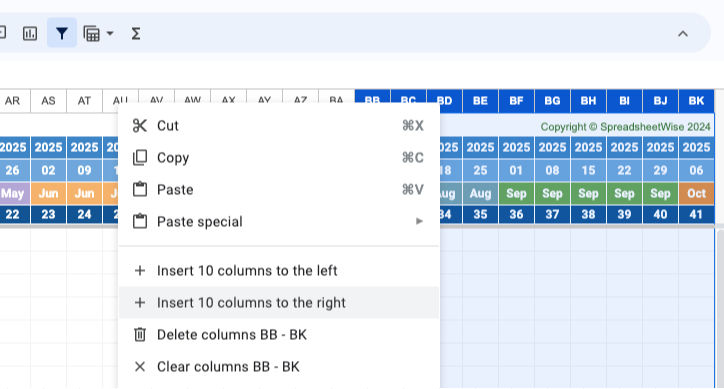
Select approximately the last 10 columns, then right-click to bring up the contextual menu and choose Insert 10 columns to the right.
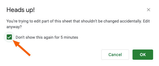
2. You'll see this message appear. You can tick that and click OK to stop the warnings from showing while you make these changes.
3. Click on column BK to select everything. Then scroll down to the bottom and click on the blue dot and drag this to the right to copy all the formatting over to new columns.
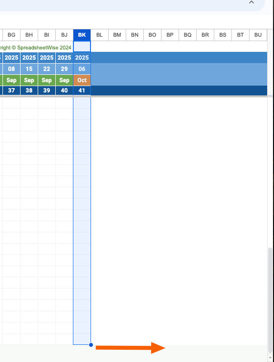
You will need to repeat this process until you have all the additional weeks you need. The Conditional formatting should carry across to these new columns if you follow this process. Once you have added a few weeks, you can select three or four weeks in one go and repeat the process but with a larger range of cells.
Conclusion
That’s pretty much all you need to know. It’s a powerful and lightweight Gantt Chart to help you visualise projects over time for individuals and teams alike.
There are one or two interesting formulas and functions within the sheet, so take some time to look at these, as this might inspire you with other sheets.
Thank you again for your purchase and for supporting SpreadsheetWise. We really do appreciate your business.
We would encourage you to check our full range of Google Sheets templates here, and be sure to check out our YouTube channel for tips and tricks in Google Sheets.
